Brand Identity & Logo Design
01A mark built from your positioning rather than a trend, delivered as a full lockup suite with construction, clear space and minimum-size rules documented.
- Logo Suite
- Vector Source
- Usage Rules
Asematic delivers graphic design services in Bhubaneswar for companies whose brand has to hold up across a hundred touchpoints, not one launch post. Identity built as a documented system, produced correctly for screen and press, and handed over with every editable source file as yours.
Delivery standard
What lands at handover on every engagement, whether it is one logo or a full identity system.
A mark is approved, an invoice is paid, and a folder of exports arrives. Six months later nobody can produce a brochure that matches the website. This is where design money leaks, and what replaces it.
What it costs you
A logo delivered as a single flattened JPG
Primary, horizontal, stacked, mark-only, monochrome and reversed — each with clear-space and minimum-size rules, so the brand still works on a sign, a stamp and a favicon.
What it costs you
Every social post looking like a different company
Editable templates with the grid, type scale and colour rules already applied, so an intern producing a post on Friday produces something that still looks like you.
What it costs you
Colours that shift between the screen and the press
RGB and HEX for screen, CMYK for process printing, Pantone for spot work, and contrast ratios checked on the pairings you will actually use for text.
What it costs you
A designer who still owns the files you paid for
Editable originals transferred to your account, copyright assigned in writing, and font licences purchased in your name rather than borrowed from a studio subscription.
What it costs you
A sixty-page brand guideline nobody opens
The decisions that matter — logo use, type, colour, spacing, misuse — in a document people can absorb, plus the templates that make following it the easy path.
What it costs you
Artwork rejected by the printer on deadline
Correct bleed and crop marks, fonts outlined, images at 300 dpi, colours converted to the right profile, and a prepress check before the file leaves us.
A pitch deck and a packaging range are different production problems. They draw on the same identity, the same type scale and the same colour rules, which is what makes a company look like one company.
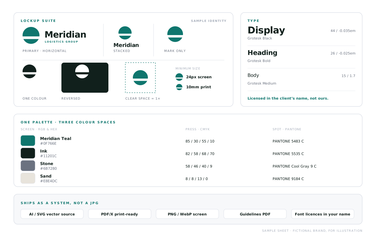
A mark built from your positioning rather than a trend, delivered as a full lockup suite with construction, clear space and minimum-size rules documented.
Type scale, colour system, grid, imagery direction and misuse examples written as rules a marketing team can apply without asking a designer each time.
Brochures, catalogues, one-pagers, proposals and trade material designed as a family, so a stack of documents reads as one company.
Structural and surface design produced to dieline, with regulatory panels, barcodes and finish specifications prepared to the converter's requirements.
A template system across formats and platforms, with the variants and safe areas already handled, so campaigns ship without redesigning from scratch.
Investor decks, sales presentations and reports built on a master template, with data visualisation that makes the argument rather than decorating it.
Screen, press and motion have genuinely different constraints — colour, resolution, file format, cost of error. Assets are produced for the surface they will live on, not exported once and hoped for.
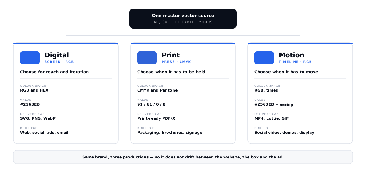
Choose for reach and iteration
Anything viewed on a screen, where files must stay light, scale across densities and be changed quickly without a production cost each time.
Choose when it has to be held
Anything going to a press, where colour is physical, mistakes are expensive, and the file has to satisfy a printer rather than a browser.
Choose when it has to move
Where timing carries meaning — an explainer, a product reveal, a logo sting — delivered in formats that stay sharp without bloating the page.
These fifteen items are not line-items on a quote. They land on every engagement, at every budget, because design missing any one of them turns into a cost your team pays later in time.
Tools do not make design good, but they decide whether a file survives the trip to a printer or a browser. These are the ones we work in, and the output is structured for whoever has to use it next.
Directions are presented in context rather than centred on a white slide, and the identity is stress-tested at real sizes before it is applied. Each stage closes with a named deliverable you review.
We work out what the brand has to signal and to whom, audit what you already have, and look at how competitors present themselves. The direction becomes a decision rather than a preference.
Deliverables
Two or three distinct directions, each presented in context on real applications rather than centred on a white slide, so you are choosing a system and not a picture.
Deliverables
The chosen direction is refined through structured rounds — construction, optical corrections, size testing from billboard down to favicon, and monochrome and reversed variants.
Deliverables
The identity is applied across the assets you actually need — stationery, social templates, collateral, packaging — with each format produced to its own production requirements.
Deliverables
Rules documented, files organised and named, fonts licensed in your name, and a recorded walkthrough so your team can use the system without coming back to us for every asset.
Deliverables
Scope determines the model, not the other way round. We will tell you honestly whether you need a new identity or a refresh of the one you already have.
A new brand, or one that has drifted
Discovery through to guidelines and handover for a fixed price. The full identity system, built once, properly, with everything you need to run it afterwards.
A defined set of assets to produce
A catalogue, a packaging range, a pitch deck or a campaign kit designed against your existing brand, scoped and quoted per deliverable.
Ongoing creative for a marketing team
A monthly block of design capacity for campaigns, social, collateral and whatever the quarter demands, with the brand system maintained as it grows.
Every quote is fixed against a written brief and a named deliverable list, so the number you approve is the number you pay.
The questions buyers actually ask before commissioning brand and graphic design work, including the ones about ownership that are easy to forget until they matter.
Cost tracks the deliverable list rather than a per-hour rate. A logo with a basic lockup suite sits in a very different bracket to a full identity system with guidelines, stationery, packaging and social templates. The production work differs enormously. We quote a fixed figure against a written brief that names every deliverable, so nothing appears as an extra later.
About seven weeks end to end. That is one week of discovery and audit, two weeks developing directions, and one week refining the chosen route. Two weeks apply it across collateral, with a final week for guidelines and handover. A standalone logo takes considerably less; a packaging range with multiple SKUs and regulatory panels takes longer.
Two or three genuinely distinct directions, each presented in context on real applications rather than as a mark centred on a white slide. We deliberately do not present ten options — presenting a dozen variations usually means none were reasoned through, and it makes the decision harder rather than easier. Each direction comes with the thinking behind it so you are choosing on rationale.
Yes, entirely. Editable vector source files are transferred to your own account with layers and naming intact, and copyright is assigned to you in writing at handover. You are not left with flattened exports and a dependency on us, and if you work with another studio later, everything goes with you.
That is what the lockup suite is for. The mark is tested from large-format signage down to a favicon, and delivered in primary, horizontal, stacked, mark-only, monochrome and reversed variants. Single-colour and outlined versions cover embroidery, stamping and etching, where gradients and fine detail simply will not survive the process.
We specify typefaces and handle the licensing so it is registered in your name, not borrowed from a studio subscription. That shortcut is common and genuinely risky: the licence leaves when the studio does. Where budget matters, we will recommend high-quality open-source or free-for-commercial-use typefaces that carry no ongoing cost.
Yes, and it is often the better call. We audit what exists, keep what is working, and document where the system has gaps that are costing your team time — inconsistent colour, missing formats, no templates. A refresh that tightens an established brand is usually cheaper and less disruptive than a rebrand, and we will say so when that is the honest answer.
We prepare files to the press specification: correct bleed, crop marks, outlined fonts, 300 dpi imagery and the right colour profile. A prepress check runs before anything is released. We liaise directly with your printer or converter on dielines, stock and finish, and can review a proof before the run. We do not mark up printing itself; you deal with the printer commercially.
Last reviewed
Reviewed and updated on this date. Technical claims are re-checked against current standards at each review.
The identity sets the impression. Where it is applied and who arrives to see it decide whether the work pays for itself. These are the pieces that usually sit either side of it.
Send us what you have — the logo, the deck, the packaging that never quite matches. You will get an honest read on whether it needs a rebuild or a system around it, and what that would involve — before any commitment.