Product & App UX Design
01End-to-end design for web and mobile products: research, flows, interface and prototype, built around the tasks users repeat rather than the features on a roadmap.
- User Flows
- Prototyping
- Mobile & Web
Asematic delivers UI/UX design services in Bhubaneswar for teams building products people open every day, not once. Research before pixels, a design system your engineers can build from, and prototypes tested with real users before a line of code is committed.
Design standard
The standard every file is checked against before it is handed to engineering.
The presentation goes well. Everyone approves. Then engineering opens the file and finds no error states, no tokens and no answer for what happens on a narrow screen. This is where design work leaks, and what replaces it.
What it costs you
A design everyone loved that tested badly
Five users on a clickable prototype will find what a room full of stakeholders cannot. Testing at prototype stage means the expensive discovery happens while changing it is still cheap.
What it costs you
Screens with no empty, loading or error state
Real products spend most of their life partially loaded, empty or failing. Those states are specified alongside the happy path, so engineering is not left inventing them at build time.
What it costs you
A style guide nobody kept up to date
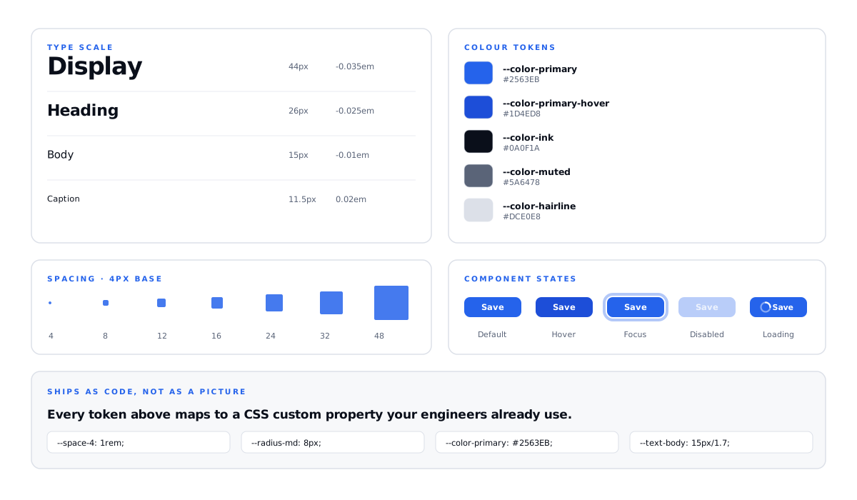
Type scale, spacing, colour and components are defined as variables that map directly to what engineering builds. The system stays true because it is the source, not a description of one.
What it costs you
Beautiful work that fails a screen reader
Contrast ratios, focus order, keyboard paths and screen-reader labelling decided during design. Retrofitting accessibility after build is where it becomes genuinely expensive.
What it costs you
Handoff as a folder of flattened images
Tokens, component variants, interaction and motion specs, responsive behaviour per breakpoint — everything an engineer would otherwise have to interrupt a designer to ask.
What it costs you
Decisions settled by whoever spoke loudest
Every significant choice is recorded with the evidence behind it. The debate is not reopened at every review, and new team members inherit the reasoning rather than just the file.
A landing page and a permissions-heavy dashboard are different problems. They get the same research discipline, the same accessibility floor and the same handoff quality.
End-to-end design for web and mobile products: research, flows, interface and prototype, built around the tasks users repeat rather than the features on a roadmap.
Dense, data-heavy interfaces made legible — tables, filters, charts, permissions and settings designed for operators who live in the product all day.
A tokenised component library with documented variants, states and usage rules, delivered as Figma variables that map one-to-one onto your front-end code.
Interviews, contextual observation, usability testing and analytics review — evidence gathered before scope is fixed and again before a build is committed.
Marketing pages designed around message hierarchy, proof placement and conversion path, with the performance budget respected rather than fought.
A heuristic and accessibility review of what you already have, with findings ranked by user impact and effort, then a redesign scoped to fix the expensive ones first.
Design engagements are easy to buy vaguely and hard to evaluate afterwards. This is the full list of what lands, so you can tell at any point what has been delivered and what has not.
Stakeholder and user conversations, plus analytics review.
Who the product serves and where the current path breaks.
Navigation, hierarchy and naming decided before layout.
Structure and content priority, resolved without visual noise.
A clickable build users can be tested against on device.
Every screen and state, at each responsive breakpoint.
Tokens, components, variants and documented usage rules.
Specs, redlines, motion timings and a walkthrough session.
Eight deliverables. One source of truth.
Research decides the architecture, the architecture decides the wireframes, and the system carries the visual decisions into code. Nothing is redrawn downstream, so what engineering builds is what was tested — not an interpretation of it.
You do not receive a folder of screens at the end of the engagement. Each of these lands as a reviewed deliverable while the work is running, so decisions stay visible while they are still cheap to change.
These fifteen items are not line-items on a quote. They apply to every engagement, on every budget, because design missing any one of them creates work for engineering that someone still has to pay for.
Tools do not make design good, but they decide how much survives the trip to production. These are the ones we work in, and the output is structured for engineering rather than for a portfolio shot.
Scope is fixed after discovery rather than before it, and the prototype is tested with users before anything reaches an engineering backlog. Each stage closes with a named deliverable you review.
We interview the people who use the product and the people who support it, review analytics and session recordings, and audit how competitors solve the same tasks. Scope is fixed after this, not before.
Deliverables
Navigation, hierarchy and content priority are settled in low fidelity, where changing a decision costs an hour rather than a week and nobody is distracted by colour.
Deliverables
The type scale, colour tokens and component library are built first, then applied across every screen and state — so consistency is structural rather than something maintained by hand.
Deliverables
A clickable prototype is tested with real users on real devices. Findings are ranked by severity and the design is revised before anything reaches an engineering backlog.
Deliverables
Engineering gets tokens, specs, redlines and a walkthrough, and we stay available through the build to answer questions and review the implementation against the design.
Deliverables
Scope determines the model, not the other way round. We will tell you in discovery which of these actually fits the stage your product is at.
A defined product or redesign
Scope, milestones and cost agreed upfront against a written brief. Best when the feature set is settled and you need designs ready for a known engineering start date.
A live product that keeps evolving
A monthly block of design spent on new features, system maintenance, research and testing, prioritised with your product team against what is actually shipping.
A team that needs design in the room
A designer assigned to you full time, working inside your stand-ups, backlog and release process — closer to a hire than an agency engagement, without the hiring timeline.
Every quote is fixed against a written brief, so the number you approve is the number you pay.
The questions product teams actually ask before commissioning UI/UX design work, with real answers rather than a sales line.
Cost tracks screen count, research depth and whether a design system is included. A focused marketing site sits in a very different bracket to a SaaS product with sixty screens, permission-dependent states and a component library to be maintained afterwards. We scope against a written brief after discovery and quote a fixed figure, so there is no hourly drift.
A typical product engagement runs about eight weeks. That breaks down as two weeks of discovery and research, two weeks of architecture and wireframes, and two weeks of visual design and system build. Prototyping and usability testing take a week, with handoff in week eight. Large platforms with many permission-dependent states take longer, and a landing page or focused redesign takes considerably less.
UX is the decision-making: who the product serves, what tasks matter, how information is structured and how a flow should work. UI is the execution: type, colour, spacing, components and states that make that structure usable and coherent. They are not separable in practice. A beautiful interface over a badly structured flow still fails, and a well-reasoned flow with unreadable typography never gets used long enough to prove itself.
Research is part of every product engagement, not an upsell. We interview real users and the people who support them, review your analytics and session recordings, and run usability testing at prototype stage. Where a client genuinely only needs visual execution against decisions already made, we will scope that honestly rather than charge for research nobody intends to act on.
Yes. Most engagements extend something rather than replace it. We audit what exists, keep what is working, and document where the system has gaps or inconsistencies that are costing your team time. If the existing system is genuinely holding the product back we will say so and cost the alternative, but that is a recommendation rather than a default.
Either. Handoff includes tokens, component specs, redlines, motion timings, responsive behaviour and a walkthrough session, and we stay available through the build to review the implementation against the design. We also build: web on Next.js and React, mobile on Swift, Kotlin or React Native. That suits you if you would rather one team carried the work from research through to production.
Yes, to WCAG 2.2 AA as standard rather than as a paid add-on. Contrast ratios, visible focus order, keyboard-completable flows, tap target sizes and screen-reader labelling are decided during design. It is dramatically cheaper to build in than to retrofit, and it widens who can use the product. In a growing number of markets it is also a legal requirement rather than a preference.
You do. Figma files, research recordings and documentation are yours, delivered in your own workspace rather than shared from ours, with full edit access and version history intact. If you move to another design partner later, everything goes with you — including the reasoning behind the decisions, which is usually the part that is hardest to replace.
Last reviewed
Reviewed and updated on this date. Technical claims are re-checked against current standards at each review.
A design is worth what survives into production. What builds it and what brings people to it decide whether the work pays for itself. These are the pieces that usually sit either side of it.
Send us the product, or the flow with the drop-off you cannot explain. You will get a heuristic read on what is causing it, what a fix would involve, and whether it needs a redesign or three changes — before any commitment.